
Serendip is an independent site partnering with faculty at multiple colleges and universities around the world. Happy exploring!
Feminist Typography: Typefaces of Feminists

When I was in NYC for my externship, at the public library I saw a talk on this book: Typography Sketchbooks. It contains (amazing) sketches, discarded works, and preliminary ideas by typography artists, who design typeface.
After going over "Lifting Belly" in class (February 16th), I was thinking about language, feminism, font, words... I was thinking (which I tried to convey in class with the help of French feminists) that there's something about the form which makes some things feminist; content is indeed important, but I do not know if I often see anti-feminist (which I recognize as different than non-feminist) sentiments expressed in the same forms I see feminist sentiments expressed in. Maybe there is something more effective about communicating in these forms rather than trying to speak the language of the patriarchy, or using phallocentric language...rigid formats and rules. I think that feminist thoughts and ideas are most effectively communicated and received when they are in certain forms.
In order to ground my thoughts about feminism and form, I decided to create typefaces for feminists, or at least the beginning sketches of such. I designed five typefaces, each with the letters of a feminist's name. In doing so, I tried to invoke ideas about what they consider feminism to be, or what I thought their main thoughts and ideas were.
LUCE IRIGARAY

Luce Irigaray is one of the French feminists that we talked about briefly in class. In "This Sex Which is Not One," she talks about the language of women being very different from the language of men. The language of women was the language of the labia, with the two "lips" rubbing together. The letters are in circles to avoid looking phallic, and to show the constrictedness of this version of feminism. While being a very sensual interpretation, it focuses too much on the biological, and excludes feminists who do not have genitals like this. I tried to show a bit of variation, from the more cartoon-like to the more realistic, but I don't think that came across as strongly.
EDIT: here's a link to the full size (for detail/legibility) http://i44.tinypic.com/20zur6w.png
KATE BORNSTEIN
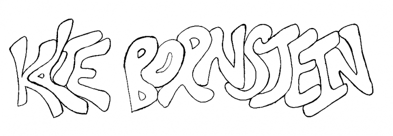
In contrast to Irigaray, I do not think transwomen feminists would put as much worth in the physical and biological when it comes to being a feminist or being a woman. Kate Bornstein is transwoman feminist, performance artist, and activist. Kate Bornstein's view of feminism is more focused on fluidity and possibility. Despite the fluidity, and the sometimes radicalness of her ideas (see: thoughts on sex and suicide) everything seems to fit togerher, even if it might seem a little skewed at first.
GERTRUDE STEIN
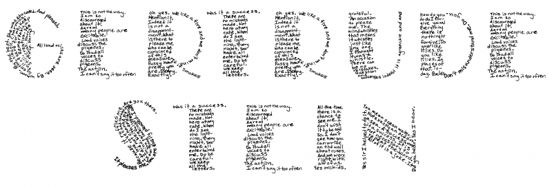
For Gertrude Stein I created a typeface that was similar in format to a concrete poem. I used various phrases from the poem "Lifting Belly" without actually using the phrase "lifting belly." These lines are rearranged, mixed among each other, chosen for size and words as much as for meaning. Some make more logical sense than others. As someone said in class, it wasn't so much about the arrangement of the words, but the thoughts that they provoked and the connotations attached to them. These thoughts are what ended up "defining" the phrase "lifting belly." From the outside, visually, Gertrude Stein's poetry appears to make logical sense--it has a form, it has formatting. The confusion comes when looking at the content and its possible meanings.
EDIT: here's a link to the full size image http://oi41.tinypic.com/2ewi00j.jpg
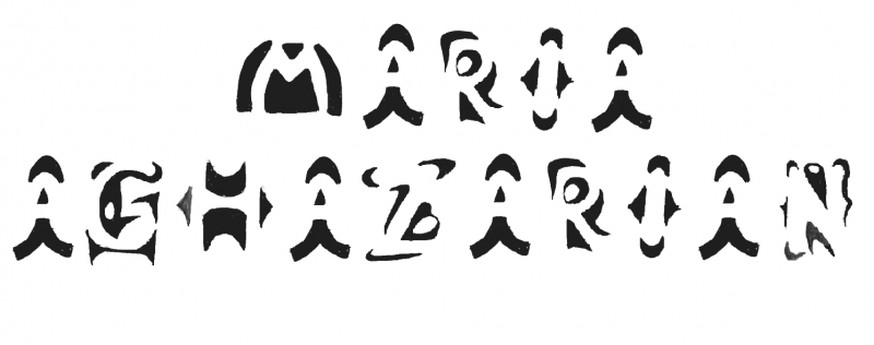
MARJANE SATRAPI

For Marjane Satrapi, I tried to create a typeface that reflected my thoughts on the graphic novel Persepolis. Through growing up, there seemed to be a rising up or ascending from a flat, one-dimensional world. With the S, A, T, and R, I tried to make it look as if the letters were supporting each other, so that through support from others and from one's past experiences, they could gain strength.
MY NAME
I tried to write my name in a way that would convey my thoughts and experiences with feminism. I started out wanting to create a typeface that filled in the (phyiscal) gaps of the letters, just as feminism and gen/sex studies has seemed to fill in the gaps of my learning. What was interesting about this was that to fill in the gaps, the shapes decided to be based on what was already there. While it was easy to design some letters, such as the I and the M, it was harder to design others like the G, Z, and N. In order to complete these, I actually had to start by drawing the letter and working around it. As you can see, the gaps are not totally filled in--there are holes in some places, and blank spaces in others. I realize that gen/sex studies is not necessarily going to be the answers to all of these gaps. However, over the years I have found that it is an access point for other studies, such as disability studies, politics, and thoughts about education and schooling.
Questions for readers: Are these typefaces legible? If they are, are they accessible?
Reflecting on the project, I thought it was interesting in the way in which the typeface only has meaning through mirroring the concepts which these people promoted/wrote about, or the ideas that I associate with them. Were these connections clear enough? It seemed to really strike me with the Gertrude Stein typeface--this is not really a typeface about Gertrude Stein but a typeface on my thoughts on Gertrude Stein.
Remote Ready Biology Learning Activities

Remote Ready Biology Learning Activities has 50 remote-ready activities, which work for either your classroom or remote teaching.
About Student Papers
| This paper reflects the research and thoughts of a student at the time the paper was written for a course at Bryn Mawr College. Like other materials on Serendip, it is not intended to be "authoritative" but rather to help others further develop their own explorations. Web links were active as of the time the paper was posted but are not updated. |
What's New? Subscribe to Serendip Studio
Recent Group Comments
-
Malena (guest)
-
yandere_chan (guest)
-
Ryan Harley (guest)
-
Serendip Visitor (guest)
-
Ecchi Lover (guest)
-
Nick (guest)
-
Rebecca A.Z. (guest)
-
Lily Isaacs (guest)
-
Serendip Visitor (guest)
-
Lulastic (guest)
Recent Group Posts
A Random Walk
New Topics
-
10 weeks 2 days ago
-
10 weeks 3 days ago
-
10 weeks 6 days ago
-
10 weeks 6 days ago
-
10 weeks 6 days ago

Comments
More.....
I saw this shirt on Facebook with the following in the description:
"Dearest Microsoft Word,
For as many years as we can remember, your default font has been set to something drab like Times New Roman or Calibri. Well, we, the members of the Association of Artisan Typographers, think it’s time for a change. We believe that you should consider a new standard font, something bold, something exciting, something like “Pictorial Smorgasbord.”
In Pictorial Smorgasbord, it is not uncommon for a single word to be made up of hundreds of tiny pictures. This means each page of your document could hold thousands – nay, millions – of tiny illustrations! Could you imagine? Every report, every essay, every email correspondence, brought to life through the miracle of art!
Of course, there are some things to overcome – like the fact that each letter you type takes up a full megabyte of hard drive space, making for some slightly larger document sizes – but all in all, we believe it would be a change for the better. Thank you for your consideration! We look forward to your decision.
Sincerely,
Tyler Banks
President, Association of Artisan Typographers"
goodness!
I'm not going to censor myself because gross censorship/boundaries of academic/nonacademic language so: HOLY SHIT THIS IS AMAZING.
One more thing...
Also, while testing the Google ranking of this post by searching "feminist typography," I discovered that Google wanted to correct it into something else:
No Google, that is not it at all. That is not what I meant at all.
"Good design is feminist design"
Utada Hikaru Typo Portrait, from 45 Amazing Type Faces....
Amophrast--
it's projects like these that remind me (as if I needed reminding...) why I give such open-ended web assignments. It had never occured to me to think about fonts as feminist, or more largely about the ways in which font design might speak its meaning. I mean, now that you put this question on the table, I guess I do think of BOLD as shouting, and italics as whispering, but otherwise...
the politics of design was not on my plate. And now you have put it there!
I'm enchanted with your experiments in typeface; each one was, to be, both legible and accessible, even before you offered an explication. I found GERTRUDE STEIN to be particularly effective, and your own name particularly evocative of an evolving feminism....
Are you familiar with the movie Helvetica? In tracing the insistent proliferation of a single typeface around the globe, it marks the opposite end of the spectrum from your experimentation with multiple "forms" of feminism (for which I say many thanks!)
Also, as a point of
Also, as a point of information to anyone who might be reading, Helvetica is available in the library!
Those type "faces" are
Those type "faces" are INCREDIBLE!! I especially like Utada Hikaru's because I am familiar with her music (and thus have a bit of a context to interpret it with). However, I cannot read Japanese, so I wonder what insights I am missing. But even the fact that "Can you keep a secret" is on her jawline (rather than in her hair, for example) is very powerful.
As I mentioned in my comment, I bought a children's book based on the style of Gertrude Stein. There are a lot of important choices made in the book, such as the positioning of the words on the page, specific repetitions, and the font size of different words. It kind of reminds me of wHeN iT wAs rEaLlY pOpUlAr tO wRiTe LiKe ThIs. I fOuNd iT vErY aNnOyInG aNd StIlL dO, bEcAuSe It Is AnNoYiNg To ReAd AnD eVeN mOrE aNnOyInG tO wRiTe In. Regardless of the fact that it (in my experience) it was used mostly by middle and high schoolers online, that way of typing does something very important--it causes you to slow down. Yes, I suppose if you practice long enough you could do it quite comfortably, particularly by utilizing the CAPS lock button, but at first, it feels unnatural. I guess I should say, at best, you slow down. At worst, you skip over it (which I must admit is often my temptation while reading). I skip over it because I can't even grasp whole words individually--I must pay attention to every single letter. (Note: I do not mean to de-legitimize middle and high schoolers. In fact, see this awesome NY Times article about teenage girls and vocal patterns: CLICK)
I watched the trailer for Helvetica and it looks amazing. It makes me think about what words are telling us, and how they are telling us. Especially in advertisements. Yesterday I was comparing two ads on the regional rail with my friend. One for Prudential Bank was particularly wordy, the words were aligned to the left as opposed to be centered or justfied (align full, etc), and the photo in the back was both non-descript (a lawn and some trees, no house visible though a house was presumably there), with the camera focus on the grass closest to it...in other words, the camera was focused on about 10% of the picture, meaning that 90% of the picture was blurred. However, an ad for Drexel had just the essentials, as said by my friend: who's sponsoring it, what it's for, a logo, simple (bold) colors, and where to go to get more information. I think the following ad conveys information in a similar way:
Regardless of political beliefs, this is a well-designed ad. Good design is effective.
Further Reading
Here's some links for further reading:
http://broadrecognition.com/arts/good-design-is-feminist-design-an-interview-with-sheila-de-bretteville/
http://letterror.com/content/dilorenzo/index.html