
Serendip is an independent site partnering with faculty at multiple colleges and universities around the world. Happy exploring!
Representation in Science: Bias and Negativity

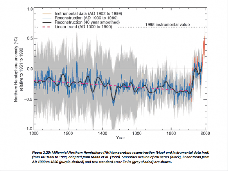
What are the similarities and differences between the following images?
(Callaway)

(Callaway)
In our 360 English class we looked at a power point created by Elizabeth Callaway who is at the University of California, Santa Barbara in the English Department. In our discussion we compared the two images above. To a majority of the class they could see the images of the trees represented in the gray area of the graph. However when I began to look at the two images I couldn’t see the trees within the graph. Coming from a science background, specifically geology, I have seen the climate change graph multiple times and I understand how to read the graph. As you look a the trees and the reflection of the trees in the water you just see a straight line, so why would you see a straight line of trees in the climate change graph that is suppose to be representing the “standard error limits” which vary in intensity (Callaway)? If you wanted to have a clear representation then you would need to photograph an image of trees with varying heights to properly represent the graph. During class I had said that another way of representing the graph would be through a heart monitor. On a heart monitor you see the intensity lines going up and down and once a person passes away the line goes flat. In a way the gray area represents an intense climate and if we continue our lifestyles as humans we will soon reach the flat line. But do we want to represent scientific data through an image of a heart monitor?
This leads to the following questions: “How do you represent scientific data?” How can you represent scientific data to non-scientists? Is there information available to non-scientists, especially information that they can understand? What is a proper way to represent information to the public without falsifying the data or being biased?
One way to represent scientific data is through the use of an infograph. An infograph is “a visual image such as a chart or diagram used to represent information or data” (Oxford Dictionaries). For our final assignment in our Sea Level Change class one of the students created an infograph about sea level change, which can be seen below:
 (Pegan 2013)
She decided to create the infograph because “[she] watched a documentary called Shored Up. There was a group of people and they were objecting the existence of sea level change. The man [in the movie] states that our data on sea level change is made from computer generated gobbledygook. [She] decided that it would be helpful to have a way to see how people collect sea level change data and where it comes from and why we say confidently that sea level change is happening” (Pegan). In the infograph she uses images and short descriptions. She discusses how sea level changes and the ways in which we collect the data using core samples. For most people who are non-scientists, images are a helpful way for them to understand data or a concept. The visuals are easier to comprehend as opposed to giving them a scientific paper using terminology that is only understood by the scientific community. This infograph is helpful to the non-scientific community and it represents the data in a positive manner. So what about data or information represented in a way to scare the viewers. The following link is to a YouTube video created by Steve Cutts entitled “MAN” and it depicts how humans have caused the destruction and the decline of the planet.
https://www.youtube.com/watch?v=WfGMYdalClU
The beginning of the video starts with an image of a man and the date being 500,000 years ago and then a figure of a man appears. Throughout the video it shows what “Man” has done over time such as the killing of animals to create clothing or other products, the use of trees for paper, the creation of cities, what factories look like, and the overall waste “Man” has produced over time. The music in this video is called “In the Hall of the Mountain King” by Edvard Grieg. The music is very intense and builds throughout the piece. The use of symbols adds a dramatic effect to the song. By having the visuals that Cutts uses and the music makes the video feel intense and dramatic and depicts humans in a negative way. After I watched the video I felt that I was guilty for the destruction of the planet and that the fear of this happening to the planet will cause me to change my ways.
But was that the tactic for the creator of this video? Causing me to be empathetic and sympathetic? People care for the world in different ways, so by trying to evoke emotion into the audience members you need to be considering the fact that people will react differently. Some might change their ways to help change the planet whereas others might feel angry after seeing this video or some might just laugh about it and think it is a joke. In a way the video almost causes the audience to be fearful or guilty. But does fear or guilt tripping people have any affect on humans and our willingness to change? Most humans are stuck in their ways and they don’t like the idea of change. But in a way the video does show us that if we continue to destroy the planet by killing animals and destroying the natural world we won’t have much of a planet left. The fact that we are destroying our planet in a sense means we are destroying our home. The man depicted in the video is wearing a t-shirt that has the word “Welcome” written on it and at the end the t-shirt becomes a door matt. Typically people associate “Welcome” on a doormat with the sentence “Welcome Home.” My own definition of “Home” is a place where I feel safe and loved so by ending the video with the “Welcome” door mat gives off the impression that the world no longer feels safe because it has been destroyed. Will that message get through to the audience? Is that a good way to represent the world to cause people to change their ways?
This all ties back to the idea of representing science in a way that isn’t biased and can be related to non-scientists. In science “there is no empathy…never get too attached to any idea. Disprove everything until something is left” (Clausnitzer 2014). You don’t want to show empathy towards a particular hypothesis or idea because that allows for there to be bias in your research or your data. Once you add bias into research and data it becomes unreliable. By having videos or infographics that invoke emotion or empathy in a way they become unreliable from a scientific perspective. However, is there a difference between having a bias in your data and allowing for a “fudge factor” in your measurements in which your measurement may not be as precise as you would like it to be (Weil 2003). Would that be considered biased? Humans aren’t perfect so we may never have perfect measurements each time we take them in the field.
While I am unsure about the perfect way to properly teach people about climate change and science, one way that is most effective is teaching students in classrooms. It is most effective teaching younger children, however schools and colleges are finding different ways to teach students about science and climate change. In the article “Classes Use Arts to Brace for Climate Change” the University of Oregon has classes that teach students about climate change through “films, poetry, photography, essays and a heavy dose of the mushrooming subgenre of speculative fiction known as climate friction, or cli-fi” (PÈrez-peÑa 2014). The classes aren’t teaching students to be fearful, instead they are teaching the students about ways in which we can change our ways and survive the decline of our planet. Overall science and climate change should not be represented in a negative way to people. The point shouldn’t be to invoke fear, guilt, empathy, or sympathy. But scientists and even non-scientists still feel that that is the best way to change people. But in the end people are very porous and will react differently to science and climate change facts and may or may not feel the need to change their ways.
References:
Callaway, Elizabeth. A Space for Justice: messianic time in the figures of the IPCC. UCSB. Department of English.
Clausnitzer, Simona (2014). The Science Binary: Objective, Subjective, or somewhere inbetween? Bryn Mawr College. Re-creating Our World: Vision, Voice, Value.
Curtis, Andrew. “The Science of Subjectivity.” The Science of Subjectivity. N.p., n.d. Web. 05 May 2014.
Cutts, Steve. “MAN.” YouTube. YouTube, 21 Dec. 2012. Web. 05 May 2014.
Dalke, Anne (2003). “2003-2004 Weekly Brown Bag Lunch Discussions: ‘What Counts?’” What Is the Better Story?. Summary Prepared by Anne Dalke.
Oxford Dictionaries. “Definition of Infographic in English:.” Infographic: Definition of Infographic in Oxford Dictionary (American English) (US). N.p., n.d. Web. 05 May 2014.
Pegan, Ilena (2013). Sea Level Reconstructions: Unveiling the Methodology Behind Reconstructions. Bryn Mawr College. Sea Level Change. http://prezi.com/u0v7tmkae2cu/communicating/.
PÈrez-peÑa, Richard (2014). “College Classes Use Arts to Brace for Climate Change.” The New York Times. The New York Times, 31 Mar. 2014. Web. 05 May 2014.
Ross, David (2003). “2003-2004 Weekly Brown Bag Lunch Discussions: ‘What Counts?’” Bucks, Values and Happiness: When Counting Changes What We Are Counting. Summary Prepared by Anne Dalke.
Weil, Arlo (2003). “2003-2004 Weekly Brown Bag Lunch Discussions: ‘What Counts?’” What We’re Counting, and Why. Summary Prepared by Anne Dalke.
