
Serendip is an independent site partnering with faculty at multiple colleges and universities around the world. Happy exploring!

Delphine Legrand and I
 I saw Girl with a Jump Rope by Pierre-Auguste Renoir appear from behind a middle-aged art father in a dark brown coat. She was placed above an antique table with two antique vases on the middle of the wall in the gallery. I approached her and was struck the most by a sense of unexplainable familiarity. I swear I had seen her before somewhere. Her eyes were the first to come alive. They were her the only features of the painting that were not crafted from fluttery impressionist brush strokes. They were bright, keen, old and youthful at the same time. Her face followed. Her face, absent of the normal amount of baby fat for an eight/nine year old, is unusually chiseled even though her small mouth and cheekbones are in soft focus. Her dress color is what turned her from a porcelain face to a live creature. It is my favorite color of blue. A lively cornflower blue with strokes of rich green. It brings out the dark red in her dark waves tied with a ribbon. Her navy leg-warmers and striped tights complete the look.
She looked at me, and I looked back at her. She smiled, I smiled. I noticed her orange necklace then. We had a moment. At least, I had a moment of deep play.
I sat down next to an elderly couple. They looked sideways at me. I was the only one on the first floor under the age of twenty.

"Entreé du port de Honfleur" by Georges Seurat
 This afternoon I had the opportunity to spend time with many incredible pieces of artwork at the Barnes Foundation. In all of the pieces I saw, one that stood out to me more than the rest was “Entreé du port de Honfleur” by Georges Seurat. It is a pointillist painting of a group of sailboats coming into port. I can’t really explain why this particular piece stood out to me so much more than the others, it wasn’t particularly large or placed as a central focus of the room it was in, it was just there on the wall, begging me to come look at it.

The Pain of Paintings

It’s always been really hard for me to connect to paintings. I’ve always thought most of them were pretty or interesting (except for Picasso, whose paintings annoyed me beyond all else) but I’ve never really gotten an emotional response from them before. Over the summer, however, I went to the van Gogh museum in Amsterdam. And for some reason, those paintings elicited responses from me that other paintings couldn’t.
I think a large part of it was the eyes. van Gogh’s subjects look directly out of the canvas, into your eyes. They invite a conversation with eyes, between you and the subject, from your time to theirs. This is what occurred in the Barnes Foundation with The Postman.
The first thing I notice about the painting is where it is hung. A corner. They tucked a van Gogh portrait into a corner? Unacceptable. At this point, I decided I didn’t like the Barnes foundation very much.
The next thing I notice is his signature. I absolutely adore the way he signs is name. There’s no tiny last name shoved into the right-hand corner. No, van Gogh signs his first name with whatever color he likes, wherever he likes. In this case, it is at the top of the painting, left-center, large and red-orange against the lime green background.


Seurat's Models
To me, one of the most intriguing paintings in the Barnes Foundation was Seurat’s Models. I was told, in AP Euro, to always first look for geometric patterns within the artwork when examining art. So, I did that, and came away with: the three models in the painting form a triangle. But that’s all. The rest of what I took away was much more conceptual and based mostly on ideas rather than strict form.

The pose of the middle model, legs spread wide, feet planted firmly on the floor, and hands clasped in front, suggests, to me, self confidence. She looks very openly at the viewer- “Yes, I’m here, what of it?” With her head tilted a little to the side and steadfast gaze, it’s almost like she’s daring you to ask her what she’s doing there. The other two models are turned away. Their body language does not suggest shyness, but they’re not as open as the middle model is. Also, we can’t see their eyes, whereas the eyes of the middle model seem to follow you no matter where you stand in front of the painting.

The Ribalds Daumier
The lack of features in the face of the woman in the forefront of this painting is what I first noticed. I kept looking because of the rough indents in her face alluded to what she might look like, they reminded me of festive movement. I think one possible reason for the lack of facial detail is that she is in movement. She appears to be either dancing or greeting someone. There is a second woman next to her that has her arm raised with her fingers spread. This pose could be one of greeting or a dance movement. The woman in the forefront further supports the idea that it is a greeting by looking at the general direction of the waving hand. She is also holding an object that resembles a book; it looks like she has stuck her thumb inside of a page to keep it open. This implies that she had recently stopped reading in order to wave at someone or dance.

The Incarnation
Standing next to a couple at the Barnes Foundation on Friday, I overheard the woman state that Albert Barnes was an artist. Each wall is organized with paintings, frames, knives, and hinges hung on top burlap and furniture below. This was his work of art as he paid a great deal of attention to the ways the pieces spoke and contrasted with one another. There is a certain balance and symmetry to each wall and Barnes tends to place paintings together with similar tone and hue. I also noticed that there were rooms and sections of the museum where paintings were clumped together based on whether they were portrait or landscape.

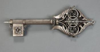
Sign for a Locksmith
Sign for a Locksmith
To say I am not an artistic person is not completely accurate; I am not a two dimensionally artistic person. I can appreciate art and the talent that it takes to create beautiful paintings, but I rarely have intense emotional connections to images of things and people I do not know. Three-dimensional art, however, makes sense to me. It has a purpose, functional or not, and, having taken 3D art all four years of high school and worked with a variety of mediums, I can see how much work went into each individual element of an object. Because of this distinction I generally find art galleries and museums to be painful. I have to force myself to think about the paintings. I do not see a painting and just know this is the emotion I am meant to be feeling right now or the artist’s use of light is to symbolize the dreariness in the subject’s heart. But I can see a sculpture and know the artist must have spent ages getting those angles right or these elements were a bitch to assemble. This is what made the Barnes Foundation so refreshing: it was not a typical art museum. I could look at the Renoirs and Cézannes and then look up and see hinges and ladles and one giant key.

Speaking with Art
 Stepping into the Barnes Foundation was nothing short of majestic. I had been looking forward to going to the Barnes for several months; even Cordelia knew how excited I was. Some people say that when you build up something you haven’t experienced in your head, all that happens is that you get disappointed. Fortunately, while I did build the museum up in my head onto a lofty pedestal, “disappointed” was definitely a word I would never use to describe my time at the Barnes Foundation.
I chose Le linge, or The Laundry, painted by Édouard Manet in 1875 to study in isolation. The painting is of a woman and a child doing the laundry in a garden. Impressionism is one of my favorite periods of art – to be honest, it’s probably everyone’s favorite period of art. There’s something about the soft, quick brushstrokes of this art period that makes me feel at ease. The painting of a woman and (possibly) her child creates a personal atmosphere, rendering it a domestic scene typical of many paintings during this time.

Remote Ready Biology Learning Activities

Remote Ready Biology Learning Activities has 50 remote-ready activities, which work for either your classroom or remote teaching.
What's New? Subscribe to Serendip Studio
A Random Walk
New Topics
-
4 days 2 hours ago
-
4 days 2 hours ago
-
4 days 2 hours ago
-
4 days 2 hours ago
-
1 week 1 hour ago
