February 28, 2015 - 21:19

I enjoyed our conversation on Thursday about (among other things) the accuracy of maps. I thought you might all enjoy Betsy Reese's powerpoint about "The Secret Life of Maps," which emphasizes the fact that every map has a purpose--and is accordingly selective. For instance, a world map can not show both shape and size accurately; the Mercator and Peter's projections have different (both ultimately unsatisfactory) ways of addressing this problem. Choosing between them is an exercise in values clarification: you have to decide what's important to you.
You might enjoy looking through a few alternatives. Consider, first, the Mollweide Projection (aka an elliptical or homolographic equal-area projection):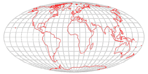
Compare the Surrealist "Map of the World," 1929, in which the Pacific Ocean is central, and the United States does not exist:
Look next @ The Upside-down Map (1943), by Uruguayan modernist Joaquín Torres-García,"a centerpiece in the history of Latin American efforts at reclaiming themselves in a world vision." Torres-García placed the South Pole at the top of the earth, thereby suggesting a visual affirmation of the importance of the continent--an effort to present a "pure revision" of the world, a modern "school of the south":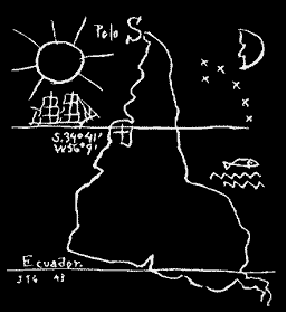
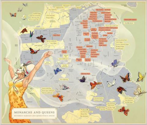
A perhaps even-more-striking image, to get you thinking about map-making as a representational (fictional?!) form, is an example from Rebecca Solnit's book, Infinite City: A San Francisco Atlas. Called "Monarchs and Queens," it juxtaposes the habitats of local butterflies with the shifting locations of queer public space:
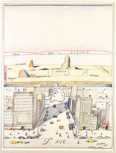
Finally, take a look the classic example of how one's point of view limits what one can see, Saul Steinberg's "View of the World from 9th Avenue" (1976):
Comments
Representing Louisiana
Submitted by caleb.eckert on March 2, 2015 - 16:37 Permalink
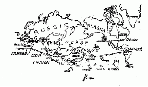
These maps (and someone's class comment about mapping the Sundarbans at a particular time) remind me also of Louisiana's rapidly submerging landmass described in "Louisiana Loses Its Boot". The authors created a new map accounting for the sinking state (which also eliminates details and leaves many waterways, land/sea marshes, and islands out):
(Left: current state map; right: re-created)
The full article is a fascinating read, particularly as we finish up The Hungry Tide.