May 31, 2014 - 22:15

Yesterday I read a really interesting article (from www.upworthy.com) about map projections.
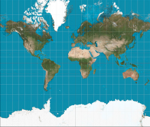
The Mercator Projection: The typical classroom map
The Mercator projection was developed by the dutch cartographer Geradus Mercator in 1569. Back in the 1500's, an age before satellites and wireless communication, maps were practical devices for long distance navigation. Because the Earth is spherical, it's impossible to unfold the Earth and accurately represent it as a flat rectangle. Therefore, in order to convert the Earth into a compact flat map, it was necessary to alter the relative sizes of the continents. In particular, the mercator projection represents distance using equally spaced vertical and horizontal lines. Dividing the Earth into equal spaces made it easier for 16th century sailors to calculate distance. However, representing a spherical Earth with equally spaced lines means that the northern and southern most landmasses appear larger than they actually are.
The "Gall-Peter's Projection" addresses the underlying political implications of the Mercator projection
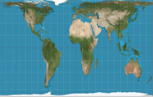
Above is the "Gall-Peter's Projection", a more accurate representation of Earth's landmasses. Unlike the Mercator projection (which utilizes equally spaced vertical and hortizontal lines to divide the Earth), the Gall-Peters projection uses larger rectangles in the center and smaller rectangles near the poles in order to accurately represent the relative sizes of the continents. This projection was developed in the 20th century in response to criticism against the Mercator projection. As you can see, Africa is HUGE in reality (when it's compared to the distorted Mercator projection)! In fact, China, the US, India, Japan, the UK, Spain, France, Germany, Belgium, Italy, Eastern Europe, and Portugal can all fit on the continent of Africa! When I learned this yesterday, I was completely astounded.
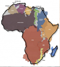
On the surface, the relative sizes of countries as depicted by the Mercator projection (the most widely recognized projection) might not seem like a big deal. However, by misrepresenting Africa as smaller than it actually is, the Mercator projection subtly implies the relative influence of Africa in relation to other symbolically "big" landmasses like China, the US, Europe, and Asia. In a world where people naturally associate larger size with larger importance, suddenly the relative sizes of countries on maps carry political connotations. The reduction of Africa's size on the Mercator projection has all to do with European ethnocentrism and imperialism. Such a reduction in Africa's size promotes the idea of Africa as a country rather than a diverse continent big enough to accomodate several other influential countries. It's shocking that I as a twenty-year-old college student am just learning this for the first time.
As I ponder how map projections propagate the power structures which diminish Africa's presence on the map and on this Earth, I wonder how my experiences in Dalun will speak to and challenge my current reflections. This reflection has helped me to reaffirm the great privilege that I have to be a Titagya fellow.
Comments
http://www.upworthy.com/we
Submitted by ktsai on May 31, 2014 - 22:24 Permalink
http://www.upworthy.com/we-have-been-mislead-by-an-erroneous-map-of-the-world-for-500-years
^^citation haha sorry forgot to put it in!