
March 23, 2026 - 01:00
Hello! I chose to do a combined midterm and final where I make a poster series for the Principles of Disability Justice and an accompanying Accessible Design Guide. The overall goals were to educate about and demonstrate ideas from disability justice, specifically the 10 principles and accessible design. What I have right now are drafts and experiments that I will build upon for my final. Below are some of the topics and accessibility features that I have been exploring through my project. I would love your ideas and feedback! Tell me what you think about one of the broad topics, suggestions you have for making my project more accessible, or which poster design you like better.
Some broad topics I have been thinking about are:
- What parts of accessibility are overlooked?
- How I can I make my project accessible?
- How can I practice the principles of disability justice through my project?
- How can I educate, share awareness, generate interest, etc. about disability justice and accessibility?
Some accessibility things I have been thinking about are:
- Plain language
- Text legibility (size, contrast, spacing, font, etc.)
- Content organization/order
- Screen reader accessible documents
- Resources with both text and audio formats (i.e., a podcast with a transcript)
Accessible Design Guide: https://docs.google.com/document/d/11RrS2L61qvq5Ejq4Hk2HEu5u922sL-1ZBlq5dxGhYYk/edit?usp=sharing
Two Ideas for Poster Design (these are not final posters):
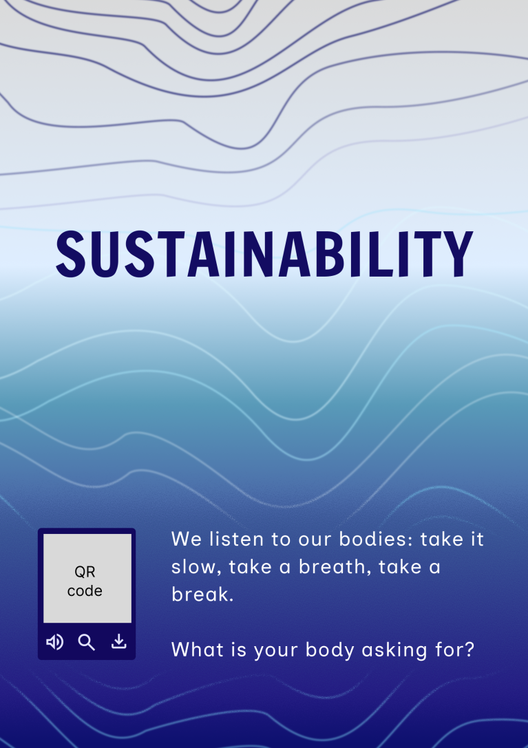
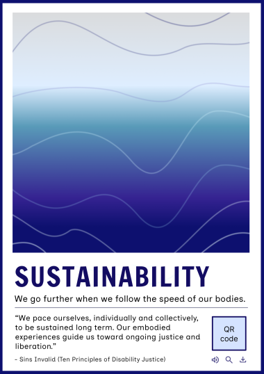
Also, the inspiration for the sustainability poster design was ocean waves and the tide. I liked how waves/tides addressed sustainability in both the nature sense and the idea of rhythmically pacing ourselves.
Comments
Response
Submitted by Lily bell on March 24, 2026 - 18:48 Permalink
It turned out so cool! I really enjoyed reading through the guide and reading about all the artists. I do think maybe the cover should say something like disability sustainability just to make it clear what the pamphlet is about. I also really like the cover, the wave motif really reads well and the blues are so nice.
I love the progress you've
Submitted by Katya on March 31, 2026 - 14:11 Permalink
I love the progress you've made on your project so far, August! It is so cool that you are both creating your own design products, centering ideas of disability justice, and creating a resource to spread information and awareness about accessible design generally, with disabled designers' work and stories as a foundation. For the posters, I really like the ideas you have so far! I'm having a hard time choosing which poster I like better, as they both have really engaging elements. Overall, I love the overall color scheme and wave-based design; they reflect the dual meanings of sustainability really well. I both like the open concept of the first poster, which seems to make it easier for the text to stand out, as it has more space, and the more structured composition of the second, which allows for the visuals and text to be processed separately, which may be easier to take in for some people. I also really liked the simplified and easy-to-understand summaries of the principle of sustainability, and especially how the first poster directly engages the viewer by asking a question for them to apply to their own experience. For the guide, I think it is so important that you are drawing from and compiling disabled designers' own work, experiences, and descriptions of access, as it is these perspectives that ensure access is responsive to real lived experience and diverse access needs. I found the guide itself incredibly easy to follow. I really appreciated how organized it was and how well the "Helpful Information" sections preface and set the viewer up to engage with the rest of the guide. The transparency and breadth of providing other resources and definitions at the end also seem extremely beneficial, providing pathways for readers to learn more and become familiar with terms and language that may make the document in its entirety easier to understand and engage with. I'm really excited to see how the project develops from here, and your final poster designs!