
Serendip is an independent site partnering with faculty at multiple colleges and universities around the world. Happy exploring!
The Postman

Samantha Plate
Play In The City
Mark Lord
11/24/2013
The Postman
I have never really had an emotional connection to a painting before. I found the notion of crying simply because of a painting ridiculous. How could a simple canvas inspire do much emotion? At the Barnes Foundation I learned exactly this.
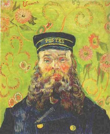
As soon as I saw one of the famous Postman paintings, off in a corner, neglected by the crowded room, I was drawn to him. Having gone round in the wrong order, this was the last room that I had left to visit, and I still hadn’t decided what work of art I wanted to view for half an hour. As I made my way over his eyes drew me in. The brilliant light blue contrasted with the rich royal blue of his uniform and hat. They seemed to have a gleam in them, like he was on the verge of tears. As I stared into those eyes I found my own eyes watering too. This surprised me. What was making me so emotional? It could have been influenced by the emotional day I was having outside of the Barnes, the Postman did not look like my granddad, but I found my mind wandering to him and the funeral that was taking place on the other side of the world. Even so it was very strange to me that I had to suppress the urge to cry in the middle of Room 2 of the Barnes Foundation.
To suppress the emotion I take a seat on the bench across from the work of art and begin to analyze the painting like Barnes would have wanted. The colors greatly interested me. So vibrant and contrasting. I wondered why he chose the green, pink, red, orange, and yellow print as the background to the dark blue the Postman wore. They did not seem to work together at first, but then I noticed the coloring of the Postman contained many of the colors from the background. His cheeks and eyelids contained the same pink as the print. His beard contained hints of green, orange, and yellow. By eyes were drawn down to the bottom of the beard. As it gets wider it becomes darker and begins to blend into the dark blue jacket. I also noticed how the green was stronger and darker around the man and lighter around the edges. This, along with a darker green accent running down the right side of the man, helps to create definition and draw your eye to the Postman.
Remembering what Mark had said about Barnes’ interest in geometry I began to look at the shapes and lines in the painting. Although the Postman’s uniform is very linear and geometric, the reset of the painting is much softer. The beard has a lot of movement and curl to it, mimicking the shapes of the paisley like design in the background. The curls and waves add emotion to the painting, the Postman is not as strict and rigid as his uniform would suggest. As I look closer at the eyes, I realize they are not symmetrical, the left lying below the right. Again, making him seem more human and approachable by having these flaws. I notice the irises of the flowers in the background are a similar shape and size to the Postman’s eyes, creating even more emphasis on those crystal blue circles. Looking for more similarities I notice that the stems of the flowers in the top left corner mirror the angles in the lapels of the Postman’s jacket. I realize that the background is not as random of a choice as it first seemed to be. And the natural look of the design helps to connect the Postman to nature.
While looking at the stems I begin to focus on the signature that accompanies them. A simple Vincent written in a slightly darker shade of the pink/red seen in the paisley design. It is unusually placed on a slant in the top left, rather than the common bottom corner placement. In fact most of the paintings in the Barnes Foundation did not have signatures. The curve of the writing, the color, and the placement help it to blend into the rest of the painting. It seems easy to miss upon first glance, but once seen it can never not be seen. There is something very personal and special about the signature to me. As I’m sitting writing a woman who seems to be teaching a class of adults walks in with her group and begins to talk about the work. She says that Vincent knew the Postman well, they lived in the same town. She says that this painting is one of six that van Gogh painted of the man but this is the only one with his signature. Many think that this particular piece was meant to be a gift to the Postman, because of the signature in possesses.
As the group leaves and my time with the painting comes to an end I stand again and approach the Postman. I look once more into his eyes. Something connects us and again I feel the strange urge to cry. The experience his this painting was one I never expected to have and sounds fairly ridiculous as I write about it now, but in that moment everything felt right. All of the other paintings and people in the room fell away and I felt a very distinct though fleeting moment of connection. Maybe it was deep play, maybe it was what Albert Barnes felt when he found the perfect placement of his paintings, and maybe not. Whatever it was it was unexpected and completely unforgettable.
Remote Ready Biology Learning Activities
Remote Ready Biology Learning Activities has 50 remote-ready activities, which work for either your classroom or remote teaching.
What's New? Subscribe to Serendip Studio
Recent Group Comments
-
artlily (guest)
-
Sources Correctionnightowl guest (guest)
-
Sourcesnightowl guest (guest)
-
Not Hannah HochSerendip Visitor (guest)
-
DisclaimerPhoenix
-
(No subject)Jessica Bernal
-
(No subject)Jessica Bernal
-
And for play in the city2, ICathy Zhou
-
Where's the "like" button.mlord
-
Source Editnightowl
Recent Group Posts
A Random Walk
New Topics
-
2 weeks 4 days ago
-
2 weeks 4 days ago
-
6 weeks 6 days ago
-
7 weeks 2 days ago
-
7 weeks 4 days ago
