
Serendip is an independent site partnering with faculty at multiple colleges and universities around the world. Happy exploring!
Play in the City 2013

 |
Welcome to the on-line conversation for Play in the City, an Emily Balch Seminar offered in Fall 2013 @ Bryn Mawr College, in which we are addressing the question of how we construct, experience, and learn in the act of play. How is play both structured by the environment in which it occurs, and how might it re-structure that space, unsettling and re-drawing the frame in which it is performed? This is an interestingly different kind of place for writing, and may take some getting used to. The first thing to keep in mind is that it's not a site for "formal writing" or "finished thoughts." It's a place for thoughts-in-progress, for what you're thinking (whether you know it or not) on your way to what you think next. Imagine that you're just talking to some people you've met. This is a "conversation" place, a place to find out what you're thinking yourself, and what other people are thinking. The idea here is that your "thoughts in progress" can help others with their thinking, and theirs can help you with yours. |
Who are you writing for? Primarily for yourself, and for others in our course. But also for the world. This is a "public" forum, so people anywhere on the web might look in. You're writing for yourself, for others in the class, AND for others you might or might not know. So, your thoughts in progress can contribute to the thoughts in progress of LOTS of people. The web is giving increasing reality to the idea that there can actually evolve a world community, and you're part of helping to bring that about. We're glad to have you along, and hope you come to both enjoy and value our shared explorations. Feel free to comment on any post below, or to POST YOUR THOUGHTS HERE.

Reading a painting at the Barnes Foundation
Walking amongst the collections of Barnes Foundation gave me such a sacred feeling about art work and the amount of attention and care we should always keep towards these treasures. Security guards in black suits everywhere kept reminding me that we should treat these works of art in awe. Those strict rules and restrictions, such as no crossing of the dark line and no drawing or sketching, built an invisible wall between the art collection and the visitors. However, the settings of each room and the arrangements were classic and even a little bit "homey".
I sit down in front of a painting above the doorframe in Room 11. The relatively small painting in the inconspicuous corner of the room immediately grabbed my attention when I laid my eyes on it. It's called The Departure of the Six-Meter Boats (La Sortie des six mètres), by French artist Raoul Dufy in 1936.

A boy and a skull
I seldom came to somewhere to see pictures by foreign painters because I believed if I could not know those painters’ background, I would not understand the deep meaning of their works. So, I just treated those works respectfully in my heart and refused to see them. However, my experience today changes in some degree my mind. And I think although the background is un-known for me, it won’t influence my enjoyment.
There are thousands of art works in front of me. Some are made by very famous painters such as Van Gogh or Monet, and others are made by unfamiliar names. I walk from one room to another, those works on the wall look at me silently, and I try to choose one work that shocks me or causes my interest. Some works are very beautiful because of their harmonious colors that are used to depict natural views. However, I cannot find the story that the painter wants to tell in such works. For me, it is important to tell the story in the work and in such works, the painter seems to just record the beautiful view in their eyes. Time is passing and I feel tired. When I enter in a new room, I decide to sit for a break. Then, when I notice the picture on the wall, I know, the one I need is here.

Garden of Eden
Jessica Bernal
ESEM- Play in The City
In the Garden of Eden
It’s quiet and rigid; I’m walking in an architect’s wet dream. This isn’t a place for the people to learn about art, it’s a showcase for the pompous and wealthy to wander and critique at their leisure. I feel like I’m invading someone’s space, someone’s dream. It doesn’t feel right, I don’t feel welcomed and the clack clack clack noise my boots make gets louder and louder as I walk further inside The Barnes Foudation.
The superfluous smell of oil pastels pull me in, I feel like a tracking dog searching all over the place for more of that intriguing sweet smell. It’s what pulls me in to a room full of paintings, antique furniture, and jewelry of the best caliber because rather than being adorned with diamonds or gold, they’re embellished with a rich story, each piece bringing culture together.
I’m walking in complete admiration once I’ve entered the halls filled with the paintings. In the first room, I can’t stop staring at Matisse’s Dancing piece and the only reason why I’ve decided to keep looking around the room to the other paintings is because my neck started to hurt. The paintings surrounding me are definitely nothing like what I’ve seen else where, but they still feel wrong, out of place.

Red Blouses and Tulips
Phoenix
Mlord
Play in the City 028
Red Blouses and Tulips
I am sitting on the floor in front of her. She looks mildly accusing; although she is being ladylike, she fixes you with her stare and her mouth is set. Her head is ever so slightly cocked.
She’s a William James Glackens painting, a white woman, middle to upper class, wearing a dress with a red skirt over ordinary sized hips and a multicolored, but predominantly red, bodice over comparatively massive bosoms. She wears dangly earrings, a red flowered hat, and makeup.
She sits—on what, the viewer can’t see. The floor or lower wall behind her is pink and flowered, and the upper wall is light pink or white. Yellow curtains above her head frame shapeless greenness. It could be a window showing a hill, or a green tinted window, or merely an expanse of green paint on the wall. A table with physically insufficient legs for standing holds a vase of four roses, in red, yellow, pink, and white. She rests her elbow on it, although by the laws of perspective it ought to be too tall for that. Her left sleeve is significantly darker than anything else in the painting. I am not sure why. The light appears to be essentially equal throughout the painting elsewhere.

Portait of a Man Holding a Watch- Barnes Verison
I like this painting. When I saw it, I was instantly drawn to it, even more than I was drawn to the Van Gogh in one of the next rooms that looked, from a distance, like a naked woman on a bed giving a “come hither” look, and upon further inspection was a naked woman on a bed whose face looked like Rowan Atkinson’s, as if someone had crudely photoshopped Mr. Bean’s head onto the body of a Post-Impressionist woman.
The colors are striking, I respect the amount of effort that went into making this, and I'm in awe of the skill.
I really, really like this painting. I connect to it. That’s all that matters. I don't need to analyze every inch of it to know that.
 |
The photo doesn't do the painting justice.
Photo: http://www.barnesfoundation.org/assets/collectionImgResize/b/bf/529_600_bf262_i3r.jpg
Portait of a Man Holding a Watch- Academic Verison
“No, am I crazy? Have we seen that one before? I think we’ve seen that one before.”
“I don’t know. I mean, they’re all Renoir, and they’re all naked ladies viewed from behind and kind of to the side, so maybe?”
“We’ve seen that one before. Definitely”
The light and airy women seem to glance sidelong at us out of their gilded frames. No, there were no repeat paintings, although judging by the shapes of the women and fruit Renoir painted, the man certainly had a type. His delicate but broad brushstrokes, typical of an impressionist, are at least present in almost every room and prevalent in many. The colors are bright and go well with the gold of the frames and walls, which make the rooms of the gallery look warm and invite the viewer in to wander as they please.
However, amidst a sea of soft colors and forms, there is an island of dark tones and well-defined shapes that starkly contrasts against the colorful lines surrounding it. Beset on all sides by small impressionist paintings, all save two by Renoir himself, Frans Hals’ Portrait of a Man Holding a Watch sticks out almost as much as the iron hinges, doorknockers, and other metal accessories adorning the walls of the Barnes.
Take a step back. The man doesn’t belong. His practically photorealistic quality stands out as a statement of differing styles against the impressionist color blocks and sense of light. He looms on the wall, sucking the light from the room.

Delphine Legrand and I
 I saw Girl with a Jump Rope by Pierre-Auguste Renoir appear from behind a middle-aged art father in a dark brown coat. She was placed above an antique table with two antique vases on the middle of the wall in the gallery. I approached her and was struck the most by a sense of unexplainable familiarity. I swear I had seen her before somewhere. Her eyes were the first to come alive. They were her the only features of the painting that were not crafted from fluttery impressionist brush strokes. They were bright, keen, old and youthful at the same time. Her face followed. Her face, absent of the normal amount of baby fat for an eight/nine year old, is unusually chiseled even though her small mouth and cheekbones are in soft focus. Her dress color is what turned her from a porcelain face to a live creature. It is my favorite color of blue. A lively cornflower blue with strokes of rich green. It brings out the dark red in her dark waves tied with a ribbon. Her navy leg-warmers and striped tights complete the look.
She looked at me, and I looked back at her. She smiled, I smiled. I noticed her orange necklace then. We had a moment. At least, I had a moment of deep play.
I sat down next to an elderly couple. They looked sideways at me. I was the only one on the first floor under the age of twenty.

"Entreé du port de Honfleur" by Georges Seurat
 This afternoon I had the opportunity to spend time with many incredible pieces of artwork at the Barnes Foundation. In all of the pieces I saw, one that stood out to me more than the rest was “Entreé du port de Honfleur” by Georges Seurat. It is a pointillist painting of a group of sailboats coming into port. I can’t really explain why this particular piece stood out to me so much more than the others, it wasn’t particularly large or placed as a central focus of the room it was in, it was just there on the wall, begging me to come look at it.

The Pain of Paintings

It’s always been really hard for me to connect to paintings. I’ve always thought most of them were pretty or interesting (except for Picasso, whose paintings annoyed me beyond all else) but I’ve never really gotten an emotional response from them before. Over the summer, however, I went to the van Gogh museum in Amsterdam. And for some reason, those paintings elicited responses from me that other paintings couldn’t.
I think a large part of it was the eyes. van Gogh’s subjects look directly out of the canvas, into your eyes. They invite a conversation with eyes, between you and the subject, from your time to theirs. This is what occurred in the Barnes Foundation with The Postman.
The first thing I notice about the painting is where it is hung. A corner. They tucked a van Gogh portrait into a corner? Unacceptable. At this point, I decided I didn’t like the Barnes foundation very much.
The next thing I notice is his signature. I absolutely adore the way he signs is name. There’s no tiny last name shoved into the right-hand corner. No, van Gogh signs his first name with whatever color he likes, wherever he likes. In this case, it is at the top of the painting, left-center, large and red-orange against the lime green background.

Seurat's Models
To me, one of the most intriguing paintings in the Barnes Foundation was Seurat’s Models. I was told, in AP Euro, to always first look for geometric patterns within the artwork when examining art. So, I did that, and came away with: the three models in the painting form a triangle. But that’s all. The rest of what I took away was much more conceptual and based mostly on ideas rather than strict form.

The pose of the middle model, legs spread wide, feet planted firmly on the floor, and hands clasped in front, suggests, to me, self confidence. She looks very openly at the viewer- “Yes, I’m here, what of it?” With her head tilted a little to the side and steadfast gaze, it’s almost like she’s daring you to ask her what she’s doing there. The other two models are turned away. Their body language does not suggest shyness, but they’re not as open as the middle model is. Also, we can’t see their eyes, whereas the eyes of the middle model seem to follow you no matter where you stand in front of the painting.

The Ribalds Daumier
The lack of features in the face of the woman in the forefront of this painting is what I first noticed. I kept looking because of the rough indents in her face alluded to what she might look like, they reminded me of festive movement. I think one possible reason for the lack of facial detail is that she is in movement. She appears to be either dancing or greeting someone. There is a second woman next to her that has her arm raised with her fingers spread. This pose could be one of greeting or a dance movement. The woman in the forefront further supports the idea that it is a greeting by looking at the general direction of the waving hand. She is also holding an object that resembles a book; it looks like she has stuck her thumb inside of a page to keep it open. This implies that she had recently stopped reading in order to wave at someone or dance.

The Incarnation
Standing next to a couple at the Barnes Foundation on Friday, I overheard the woman state that Albert Barnes was an artist. Each wall is organized with paintings, frames, knives, and hinges hung on top burlap and furniture below. This was his work of art as he paid a great deal of attention to the ways the pieces spoke and contrasted with one another. There is a certain balance and symmetry to each wall and Barnes tends to place paintings together with similar tone and hue. I also noticed that there were rooms and sections of the museum where paintings were clumped together based on whether they were portrait or landscape.

Sign for a Locksmith
Sign for a Locksmith
To say I am not an artistic person is not completely accurate; I am not a two dimensionally artistic person. I can appreciate art and the talent that it takes to create beautiful paintings, but I rarely have intense emotional connections to images of things and people I do not know. Three-dimensional art, however, makes sense to me. It has a purpose, functional or not, and, having taken 3D art all four years of high school and worked with a variety of mediums, I can see how much work went into each individual element of an object. Because of this distinction I generally find art galleries and museums to be painful. I have to force myself to think about the paintings. I do not see a painting and just know this is the emotion I am meant to be feeling right now or the artist’s use of light is to symbolize the dreariness in the subject’s heart. But I can see a sculpture and know the artist must have spent ages getting those angles right or these elements were a bitch to assemble. This is what made the Barnes Foundation so refreshing: it was not a typical art museum. I could look at the Renoirs and Cézannes and then look up and see hinges and ladles and one giant key.


Speaking with Art
 Stepping into the Barnes Foundation was nothing short of majestic. I had been looking forward to going to the Barnes for several months; even Cordelia knew how excited I was. Some people say that when you build up something you haven’t experienced in your head, all that happens is that you get disappointed. Fortunately, while I did build the museum up in my head onto a lofty pedestal, “disappointed” was definitely a word I would never use to describe my time at the Barnes Foundation.
I chose Le linge, or The Laundry, painted by Édouard Manet in 1875 to study in isolation. The painting is of a woman and a child doing the laundry in a garden. Impressionism is one of my favorite periods of art – to be honest, it’s probably everyone’s favorite period of art. There’s something about the soft, quick brushstrokes of this art period that makes me feel at ease. The painting of a woman and (possibly) her child creates a personal atmosphere, rendering it a domestic scene typical of many paintings during this time.

the postman
The eyes. He is staring at you, at every angle. I was attracted at the first glance of “The post man” by Van Gogh. People will be swamped into his deep eyes with complex emotions. I couldn’t resist sticking to that pair of eyes. At first, I feel the sadness, and then I find a sense of pride and even arrogance inside. (Maybe because he stares at me directly as the way I stare at him for a long time.) The whole painting is full of lines and mixed colors. His mustaches are twisted, curly and dark; his face is not that clear with various tones of colors combined (warm color such as orange, red and pink, cold colors such as cyan, gray and dark green); however, in sharp contrast, his eyes are so clear. The blue eyes are breathtakingly beautiful like a holy lake surrounded by the messed forest. It has a magic power that I can’t move away my sight. After a long time, I find that it is not sad, not arrogant, but innocent. No. It is some kind of innocent grief that being expressed from his eyes.

The Novice
This weekend I had the good luck to pick the painting that simply does not exist outside of one small side-gallery full of Picassos and Manets. In other words, “The Novice” by Afro Basaldella is incredibly obscure (it was not listed on the Barnes website or even in the artist’s own archive), so I am, unfortunately, required to describe a complex piece without even the luxury of a picture.
Let’s begin this nigh impossible task: The background is two different shades of blue-green. Divided by a red-brown line that bends sharply in the middle of the canvas. Below the line, there is a light greenish color, while above the line the darker blue-green dominates. Littering the entire background are barely noticeable hints of red, like a paint brush dipped in nearly-dry paint and dragged lightly over a few patches of the canvas. From afar, they disappear into the blue-green. In the middle of the picture is a figure of a boy. The figure begins at the bottom with two lines (of the same red-brown color from earlier), which taper slightly inwards to form the neck and sitting on top of this neck is an ovular face. A trapezoidal nose sits in the middle of the face while on the left side of the nose is a black pupil-ed eye with an iris of the same color as the lines. Even further to the left lies a pink ear jutting out from the side of the head. Neither of these features are mirrored on the right side of the face.

30 Minutes with Matisse
Within the beautiful modern architecture of the Barnes Foundation, hundreds of insanely famous artists and masterpieces are showcased. After a few hours of being overwhelmed by the different rooms, I decided to sit down for a bit. I rested on a bench in front of a giant painting by Henri Matisse. I stared at the work, not especially liking what I saw. As I sat there, however, the piece grew on me, and before I knew it, thirty minutes had passed.

Some things I noticed from looking at the painting:
The colors are very vibrant. The contrasting dark green versus pink versus teal drew my attention to it in the first place. When I first glanced at it, it appeared gaudy, clown-like, and like a cry for attention, but I soon noticed the smaller details, like the shading on the man’s face, which showed true skill.


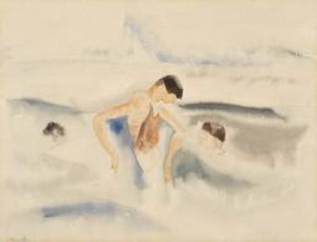
Tricky Demuth
I glance at Demuth’s Three Figures in Water, and see three people swimming in the ocean. I begin to walk away, but as I take a step back, I realize that there are not three people in the painting, only three figures. Each figure has black bowl-cut hair. And, even though I cannot see one of the figure’s faces, I assume that he looks like the two other men in the painting. Like them, he has light skin and soft features. I see that all three figures are replicas of each other. They might not be three people; Demuth may have painted one man in different positions. First, he may have painted a man who is completely submerged in the ocean. Then, Demuth painted the same man again, but had him stand up in the water and rest his arms on the waves. And, Demuth may have painted this man one last time. On the right, the man swims in the ocean with his head above the surface.
Remote Ready Biology Learning Activities

Remote Ready Biology Learning Activities has 50 remote-ready activities, which work for either your classroom or remote teaching.
Recent Group Comments
-
artlily (guest)
-
Sources Correctionnightowl guest (guest)
-
Sourcesnightowl guest (guest)
-
Not Hannah HochSerendip Visitor (guest)
-
DisclaimerPhoenix
-
(No subject)Jessica Bernal
-
(No subject)Jessica Bernal
-
And for play in the city2, ICathy Zhou
-
Where's the "like" button.mlord
-
Source Editnightowl
Recent Group Posts
A Random Walk
New Topics
-
3 weeks 2 days ago
-
3 weeks 2 days ago
-
7 weeks 5 days ago
-
8 weeks 1 day ago
-
8 weeks 2 days ago
