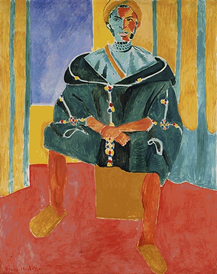
when i first walked into the main large gallery, i think i exclaimed an "oh"... first my eyes were attracted to the matisse... the use of color... how the facial lines were emphasized as a result.
.
.
.
.
.
but then . . . .
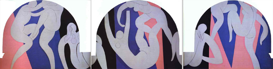
i saw the matisse filled arches..those were beautiful, how the curves resonated, they filled the spaces, the alcove caressing 'round the dancers.
.
.
.
.
.
it felt perfect.
.
.
.
.
.
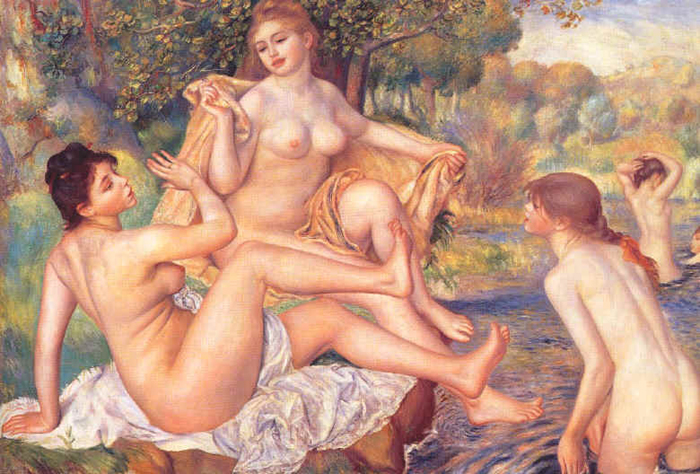
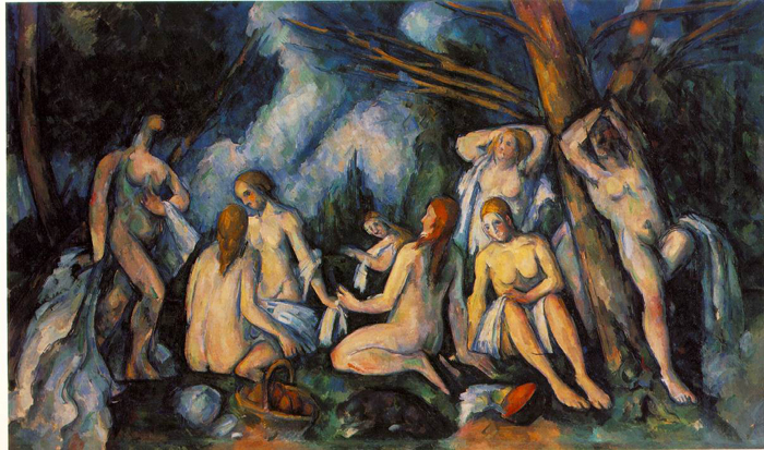
then i turned around and spent a long, long time on the bathers (of many versions). i immediately liked the renoir bathers best. the bodies are more beautiful, cezanne's are distorted, less soft.
.
.
.
.
.
i loved the same arrangement that brittany wrote about: the reclining nude with the basket-holding girls looking at her and the formal portrait above. i imagined the recliner as the center of attention, dreaming, content with herself...
.
.
.
.
.
i don't know if i ever had barnes experience of esthetics as i went through.. to be sure, my knowledge of pigments and paints interfered. that's why i dismissed pretty quickly the medieval painitings... instead, i only looked at them as specimens of the limited palette available and the damage to the paint that makes most of them pretty impossible to see as they were once painted.
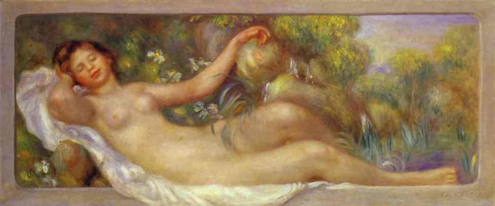
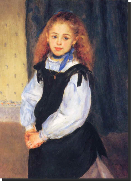
likewise, i analyzed my affinity of the renoirs, like these:
i realized the skin was a million shades...
.
.
.
.
.
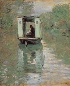
the most beautiful painting was a monet... and I spent a long time looking at it, analyzing my "beautiful" response. this is a poor reproduction indeed...

was it just because it was a "monet"? no there was something about the composition and tone balance. i wasn't alone.. a woman also peered at it quickly, then with a double take and said "that's beautiful"...
.
.
.
.
.
for the most part, the surounding metal art didn't enhance the paintings at all... the only one i found interesting was due to its incorporation of alchemical symbols.
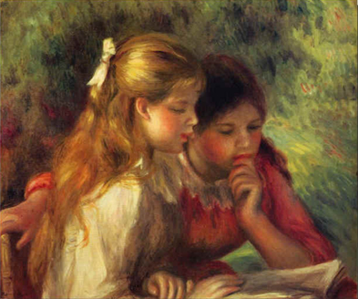
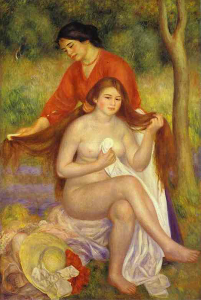
more images that moved me:
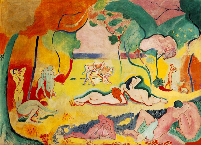
joy, indeed!
why do i like this? lots of shapes?
i like the female body, the lines of the composition
it's simple: blue + yellow
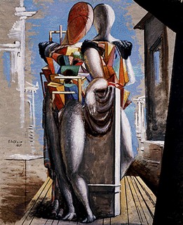
not beautiful in the normal sense, rather, intellectually stimulating = beautiful
. . .. .. .. . . . . .. . . . . . . . . . . . . . . . . . .. . .. .. .. . . . . .. . . . . . . . . . . . . . . . . . .. . .. .. .. . . . . .. . . . . . . . . . . . . . . . . . .
yes, i can testify we can certainly learn to see differently if not better.
i know i now see everything completely different because of watercolor painting.
"there is in evergy great work of art a pervasive and subtle qulaity which defies ananlysis"
"But the forms themselves will have little significance .... unless the spectator has within him(her)self the spark of life which makes those forms living realities capable of setting in vibration feelings akin to those wihcih the artisti had when he(she) painted the picture."
I'M important. YOU'RE important.
In all human experiences, inso far as there is truly harmony, the self is expanded, and the mystical emotion has play."
"In the final analysis, it is a matter of interest....."
- attention
- be aware
- care